 Most financial reporting is absolutely terrible, not worth the electricity it takes to transmit it. There are many, many problems with financial reporting, but for this morning I want to pick out a subtle bias.
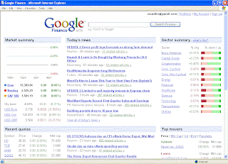
This is an image of Google Finance before US markets open in the morning.
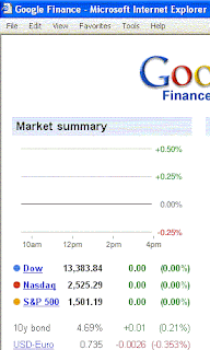
Here's a close up.

By showing marks descending only to -0.25% but rising to +0.5%, it is implied that market declines will be less (and less likely) than increases. While this is true on a long term (multi-year) basis, for a single day it is false.
If even such a basic (and presumably objective) tool as a chart is so badly biased, what does this say about the state of financial reporting?
No comments:
Post a Comment